business cards
Creative Business Cards
Business Cards: Using Your Creativity to Stand Out
It seems that everywhere you turn these day, there’s always someone who is attempting to start a new business. It can be a little intimidating to try to compete with the rest. This is especially true when it comes to those who are in your same line of business. So how does one stand out among the hordes of budding entrepreneurs? Simple–you take a creative approach to marketing!
Sure, you may have the same services and in some cases you may even offer them at the same prices, but if your branding is better, then your customer will assume that you are the more competent choice. This means that you must make it one of your top priorities to be memorable and leave a lasting impression. And one of the best ways to do this is with your creative business cards design.
Humour in The White Space
There’s something about the idea of owning a business that makes us assume that we have to lose all of our personality in order to be successful. Of course you may be a little more reserved in business situations, but there are some cases in which you should use your personality to your advantage. Marketing your business is one of them. If you have a knack for making people laugh or are particularly witty, then don’t be afraid to show it through your business card. People remember what’s funny and we like things that make us feel good. So it’s a win-win situation here. Make people laugh and make them like you by associating your business with humour. Just keep in mind that this type of approach may not be suitable for every business so you’ll have to use your best judgement to ensure you don’t offend potential customers.

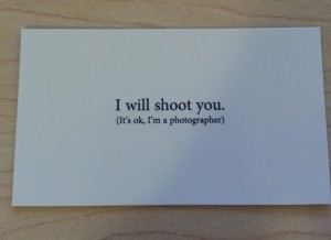
Though it’s often seen as a graphic design faux pas to leave too much white space available, in this case you can use the white space to grab the reader’s attention and then when you have it, use your humour. This designer used an unforgettable play on words, “I will shoot you. It’s okay, I’m a photographer.” Not only will the customer find it creative and funny, but they’ll likely share the joke with friends and simultaneously promote your business.
Use a Font That People Aren’t Used To
When it comes to fonts, most people are not very adventurous in their designs. And there’s a good reason for this; not every font is pleasing to the eye and some can even be distracting and difficult to read. So when marketing, most people choose the fonts that are simpler and by default these can give the card a very standard and commonplace appearance. One way to distinguish yourself is to choose a font for your business card that is both easy to read and uncommon. If you can’t find one that goes with the image that your business is trying to portray, then you may even consider hiring someone to create a font from scratch. Why does this work so well? Well, we are interested in things that are different and new. So when presented with a font that we aren’t used to, it easily catches our attention.

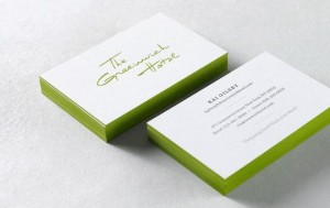
In this example, even though there are two sides to this card, your eyes are immediately drawn to the most interesting font. Additionally its green accent colour helps it to stand out even more.
Give Your Logo the Spotlight
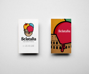
Business owners normally take pride in their logo, because it takes a lot of thought and creativity to come up with an image that conveys what you want to say at a glance. Strangely, when it comes to creating a business card, most people don’t take advantage of it. They’ll cram all of their information into one little dimension which limits how much of an emphasis they put on their logo. This is where you can have an edge on the competition. Step outside of the box by featuring your logo which takes up the entire back of your card.

In this example, the designer covered as much white space as possible so as to leave a significant impression. There’s no greater instance in which you want people to understand your message at a glance than when you hand them your business card.
When designing a business card, some assume that you have to go over the top with different material and sizes other than the standard. But sometimes this approach can also backfire. In fact, if you’re not careful some of those highly decorated business cards can come across as a little gimmicky and cheap or even be discarded if they are too large. Remember sometimes less is more.
